Brand and logo guide

The Hobart City of Literature (HCoL) brand reflects the rich storytelling culture of the past and present, and the work of our community in a spirit of collaboration to develop initiatives to support creative outputs and develop accessible pathways for everyone to engage, contribute and enhance the city's culture of literature for generations to come.
The logo was created by designer Demelza Rafferty in collaboration with the HCoL working group. Every element carries meaning connected to our place, our readers and our writers.
The HCoL has a set of master brand logos for all its activities and communications.
This page and the brand user guide document contain guidelines and examples of how the HCoL logo should be applied across general usage, sponsorship or partner applications.
Hobart City of Literature brand user guide(PDF, 4MB)
Logo overview
All Hobart City of Literature activities, initiatives, services, programs and experiences are represented by the HCoL logo.
The primary logo is preferred unless there are particular spacing or layout issues, in which case the secondary logo should be used.
There are also two other iterations of the logo:
- The feature logo is intended for use as a graphic.
- The UNESCO Creative Cities lock-up logo is to be used for specific Hobart City of Literature initiatives.
More information about using these logos is included below.
No other versions of the logo are to be used.
What does the Bookish Bird logo represent?
The image suggests an open book, with the tail forming the end of a bookmark and the tail of a bird. The eye, symbolises the reader, or the nib of a fountain pen, representing the writer. The blue colour reflects the sea surrounding Lutruwita (Tasmania), grounding the logo in our island identity. The bird evokes our deep love of nature, and with its wings outstretched, it also speaks to taking flight, taking risks and letting stories soar.
Together, these elements express who we are: a City of Literature shaped by readers, writers, nature and place – always open, always in motion
Logo guidelines
Clear space
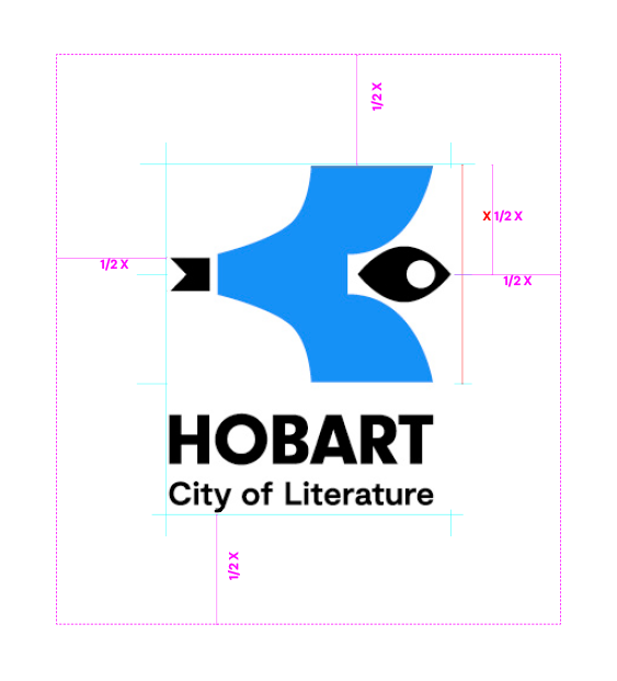
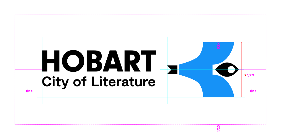
The logo should have a minimum of 1/2 X around it at all times, where X is the height of the bird.
The dimensions are fixed and should not be changed.
Primary logo
Secondary logo
Colourway options
Colour
The blue/black option is the preferred colour.

Black
The black version is acceptable for single-colour designs.

White
The white version is acceptable on designs with dark backgrounds.

Feature logo
The feature logo is intended to be used at large scale where the logo acts as the main hero image.
For example on a poster or billboard or banner flag.
It is not intended to be used at small size.
UNESCO Creative Cities lock-up
Using the logo lock-up with the UNESCO Creative Cities logo must be used in adherence with UNESCO logo guidelines.
It is for use only for specific initiatives as determined by Hobart City of Literature.
What not to do
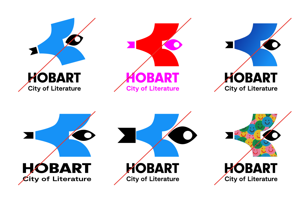
To avoid eroding the brand integrity and for consistency, the HCoL logo should not be altered in anyway.
Do not:
- rotate any part (individual elements or the whole logo)
- stretch or distort
- tamper with individual elements
- modify the colours outside of the approved sets
- use gradients
- fill the bird with textures or graphics.
These examples of what not to do are not exhaustive, but cover off some key things to avoid, and that will not be approved.
These examples apply to all versions of the HCoL logo.
Brand colours and fonts
The brand colour palette and support font information can be found in the brand user guide.
Hobart City of Literature brand user guide(PDF, 4MB)
Downloads
Below is the download link for the Hobart City of Literature logos.
Hobart City of Literature logo suite(ZIP, 11MB)